

VISION Portal
// Product Design
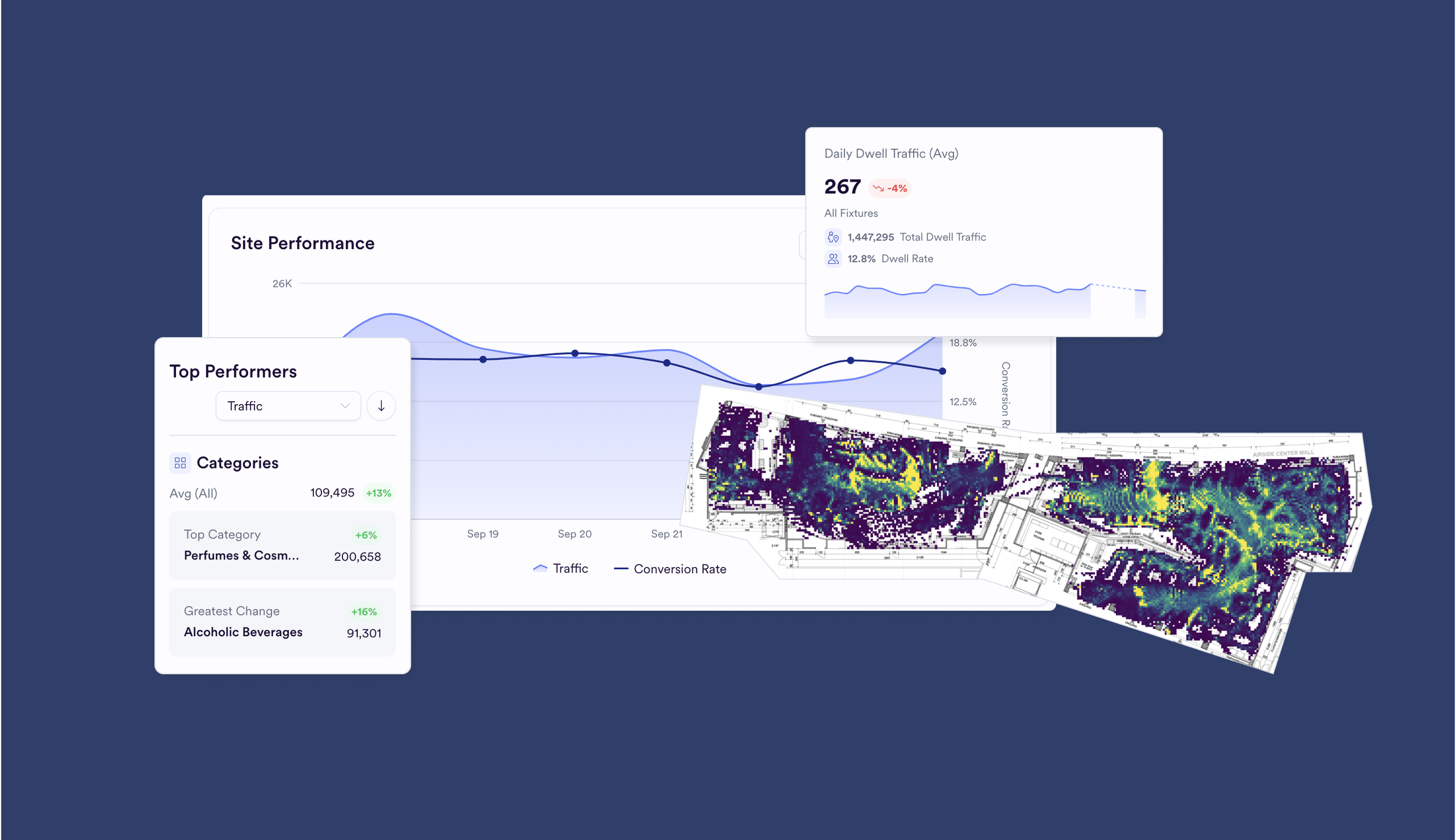
The VISION Portal is website analytics for a physical store: how shoppers and employees behave in the space, with no facial recognition.
We went from two to three hand-built reports per client a month to building 1 per client per quarter. It is live, with hundreds of users.
Goal
Turn a reporting service into a self-service product that creates revenue.
Create one self-serve portal where retail teams can see how shoppers and employees behave in their own stores, and answer their own questions without waiting for a report.
Roles
Emerson Hobson — UX/UI design, research, prototyping, design system, front-end build
Chris Arnold — VP of Product
Amanda Ferreria — Front-end development
Igor Moisev — Engineering Director, code review
Alex Nelson — Analytics Director
Timeline
November 2025 → July 2025 (ongoing)
Constraints:
• A very small team
• No front-end developer post-initial release
Tools:
Figma, Figma Make, Adobe Premiere Pro, Github, Claude
The Challenge
Before the Portal, we were creating 2 presentations per month per client, giving insights on their data. They agreed it was valuable, but there was no way to interact with it, no matter how useful. Insights took too long to gather and we wanted to be a product, not a service.
Research and Prototyping
“This is really great, I can now find all of the insights and data for my reports in one spot.”
- Lily, Global Store Manager at a duty free store.
Months of market research, which I helped plan and run, kept pointing to one gap: no one else showed the data on a visual of the store itself. They wanted to run tests and gather insights, but it was hard to tell the “why” in the data when they didn’t have the “where”.
As a proof-of-concept, I built a prototype prospects could play with, and we took it to meetings and conferences to see which ideas landed. It grew into a living, hosted demo with a database connection, and proved we could build a production-ready front end with AI coding agents.
Early prototyping:
“This is great, but we don’t need another dashboard”
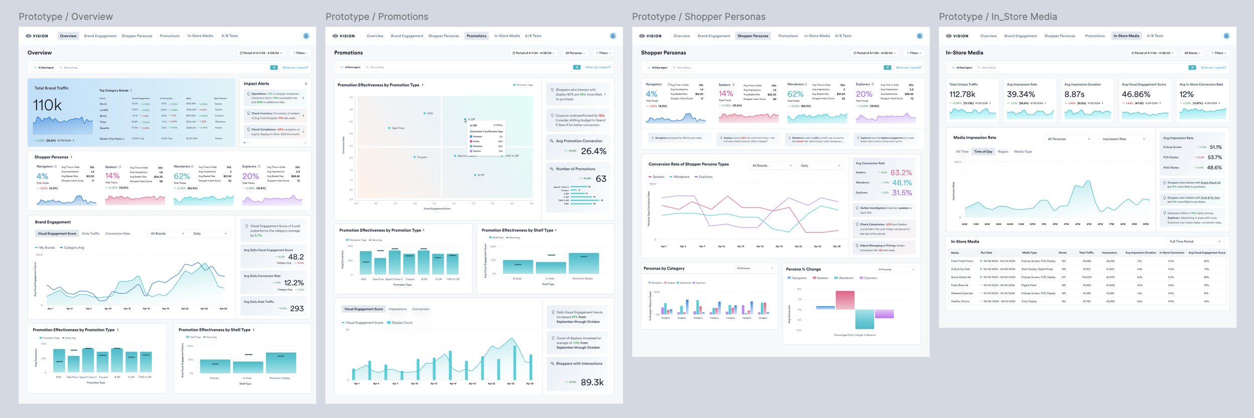
Throughout our research and prototyping process, we learned that users didn’t just want data. To set us apart, we had to show them visually. Things we changed:
Ability to view data on their floorplan
A natural-language query to ask about their data
Visual traffic heatmaps
A/B tests
Late prototyping (video I created to help increase reach):
Showing off our VISION prototype immediately booked meetings.
For the first time, prospects could understand our product. Now they wanted it for themselves. The POC was a success.
Prioritizing Features
Many use-cases. Many features. Not a lot of time.
While our use-case is niche, the spaces in which it is utilized is not. I needed to design with many users in mind:
Analytics What they want to know: What changed, and why. Where they look: Categories down to fixture, brand, screen and promotion.
Category, Promotion and Marketing Teams What they want to know: What changed, what did visitors engage with and why? Where they look: Categories down to fixture, brand, screen and promotion.
Operations What they want to know: Queue waits and missed chances to convert. Where they look: Queue trends, employee shopper interactions
Executives What they want to know: How sites compare. Where they look: Fleet-wide performance
We could not build it all at once, so I recommended what to cut.
AI insights were the hardest cut. People really responded to them, but they were costly to build, and the bigger risk was trust. Inaccurate insights would stop customers trusting our data, so we prioritized other wins as we prepared to release the NLQ and AI insights after we had lots of data to QA.
Fleet-performance was also de-prioritized. Our first Portal customer is international and rarely compared site to site, and we decided building the currency conversions for in-depth analytics could wait.
Prototype → Production
Design system: Based on shadcn, because we needed to be fast and had few resources. It keeps the portal scalable.
Color and branding: I created both. We didn’t have much time for fun extras, but I did make a small loading spinner.
Process: I started the way I normally work: Figma, low fidelity to high fidelity, then a hand-off to Amanda, our front-end developer. By the end I was playing around with the Figma MCP, using the design system to do less manual work pushing pixels and to shorten the hand-off.
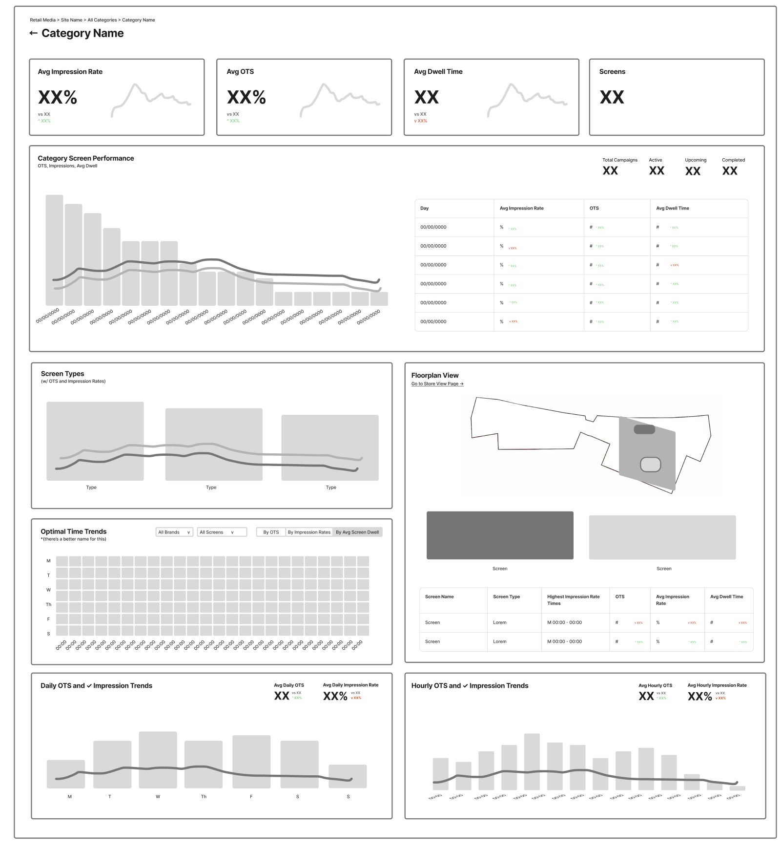
Low-fidelity
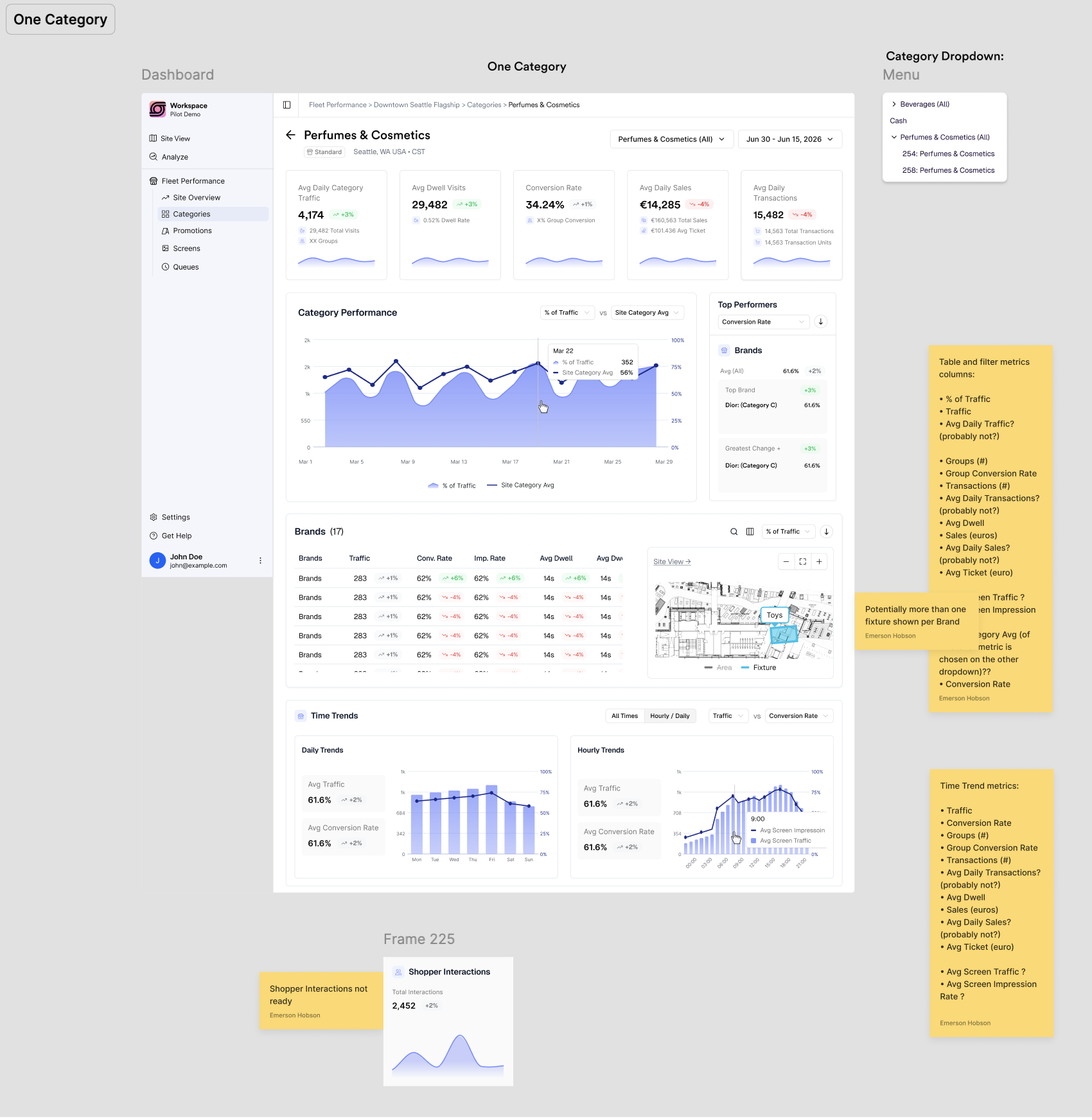
High-fidelity
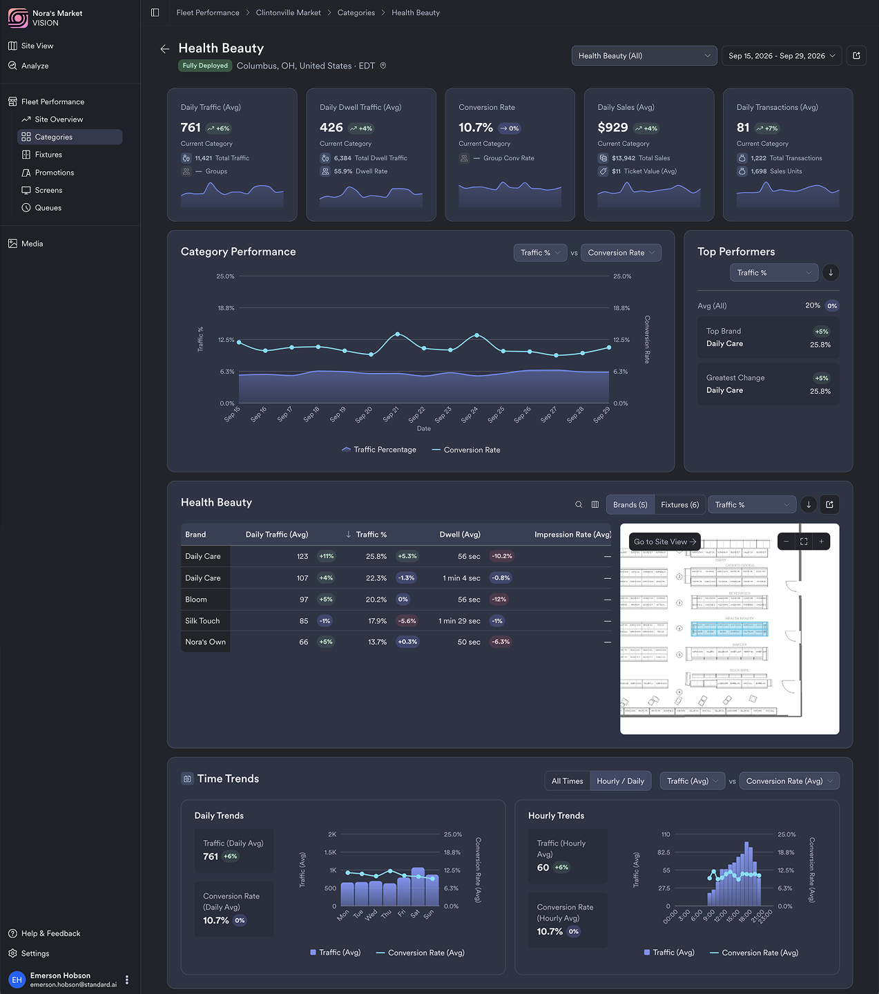
Production
(on dark mode)
⚠️ The Unexpected Challenge
By the time the Portal shipped, we no-longer had a front-end developer. I loved working with Amanda so much and knew I’d miss her moving forward. Since I had been learning to prompt engineer throughout the project, our CTO and VP of Product asked me to pair up with our Engineering Director and see what I could do myself.
I love the project and enjoy new challenges, so I decided to dive in. While there have been growing pains, I have since been:
• Running sprints, shaping the roadmap and feature prioritization
• Designing and engineering Portal updates
• Pushing bug fixes and real production code, with Github, Claude and the review and support of our Engineering Manager, Igor
Current State (w/ Demo Data)
Main Feedback and the Future
“More customizability”
We built the Analyze page to retroactively A/B test, which our research and feedback and feedback all pointed to. To keep it properly “A/B”, it let users change exactly one thing: one fixture across two date ranges, one category against another, or one site against another.
After launch, the Analyze page gained the second-highest traffic (second to Site View), but want tables and charts from as many areas as possible, and even to combine two or three fixtures and compare them to another.
In Progress:
• A fully updated Analyze page, without A/B constraints
• Pilots are about to move into the portal, which should take reports to zero and hope to close deals even faster.
• The AI insights we held back are on their way: I am building them now, including a chatbot for support and insight questions, and range markers on the charts to help users flag anomalies quicker.

Results
We went from 2 to 3 hand-built reports a month to building them only for pilots.
Each report took the team about half a week. My own share of reporting is now two to three hours a month.
The portal is live, with hundreds of users.