

Propensity’s Design System
Goal
Create a lean design system that can hold up in a fast-paced, rapidly iterating startup.
Roles
Me — UX/UI Design
Front-End Development -- Jason Bean
The Challenge
Small team, lots of change.
When my company created a new brand and business model as Propensity, our old system had outdated colors, components, and served the purpose of entirely different product.
Our code and designs were becoming brittle and unscalable with the fast pace we were working in. In order to build consistency, our front-end developer, Jason, and I took it upon ourselves to chip away at a lean, scalable Design System. I dug into research and creating Figma components, which he built into usable code and documentation.
Research
Being the only designer on a small team, I had a lot to learn. I reached out to more experienced designers for advice and did deep research into the many design systems available. I decided not to invent the wheel, and as many before me, I became profoundly inspired by Material, Apple, AirBnb and many more systems. Since they have hundreds on their staff to research and test, I knew they were a good resource for someone with less opportunity to do so off the bat.
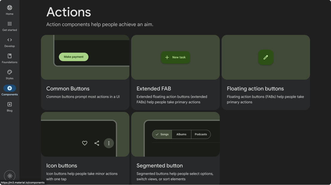
Material’s design system resources.
Building
Since our product was iterating so much, I wanted to focus on elements that would depend less on use-case. I created a workspace in Figma and began the challenge.
Colors
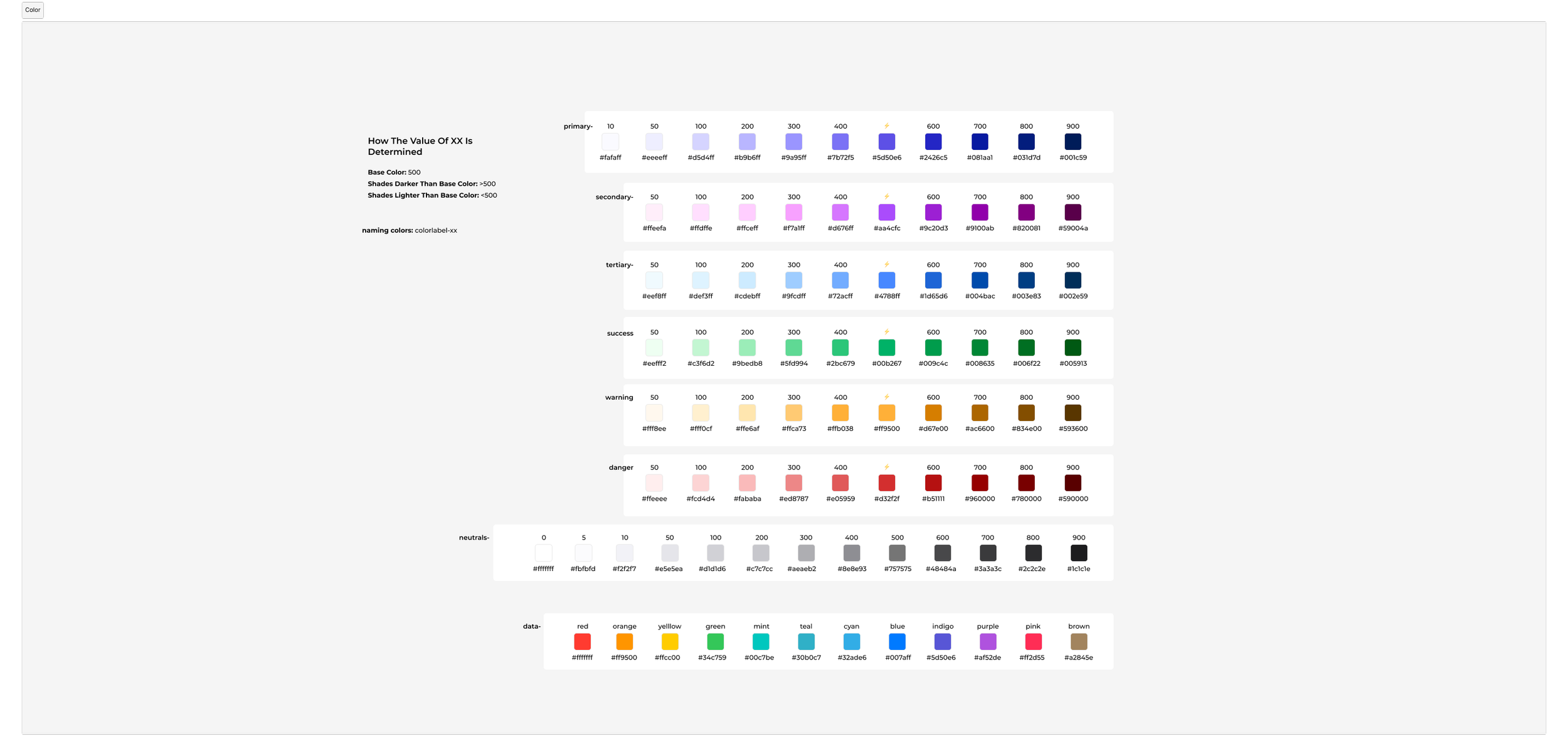
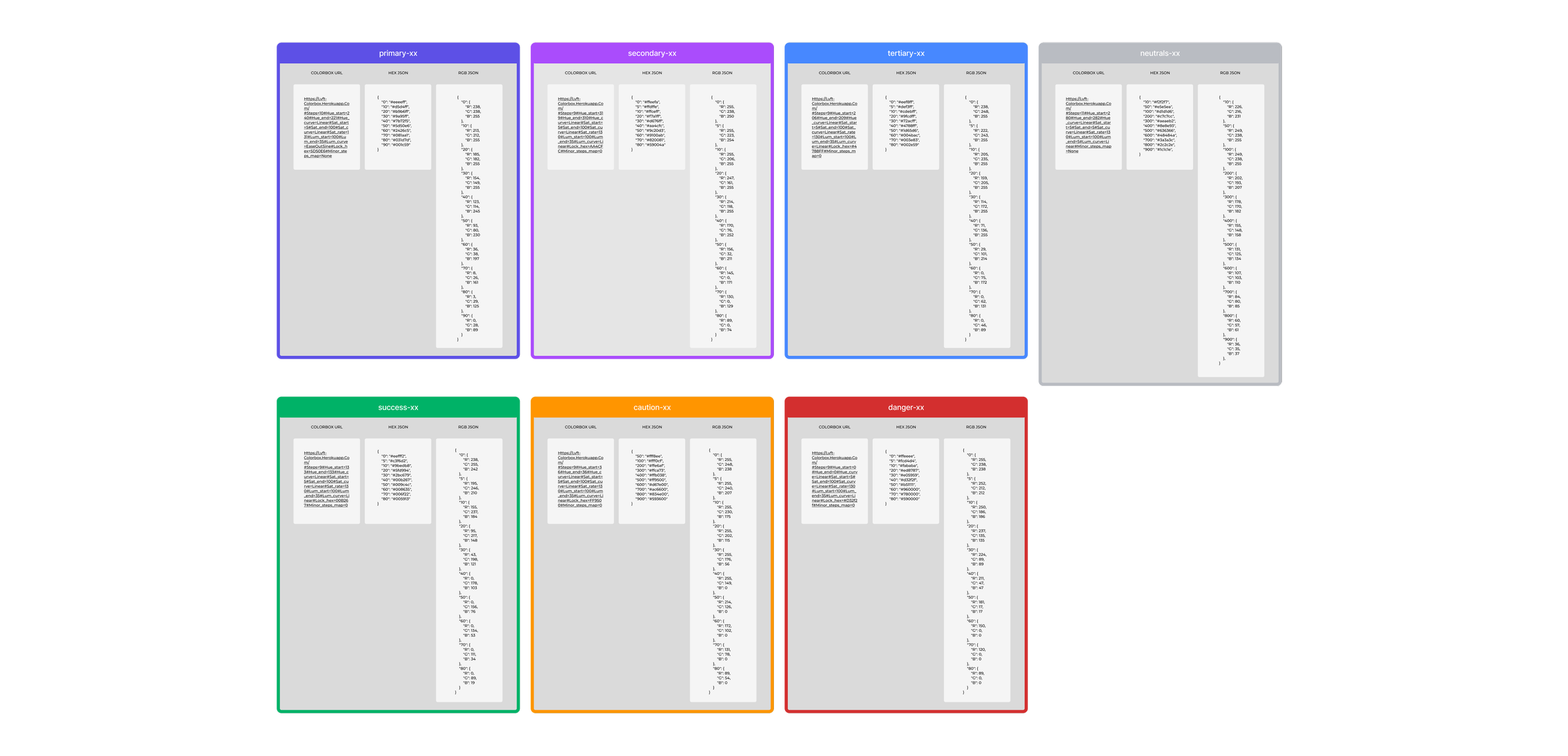
I started with color, which is used in every part of the UI. I decided on cool color tones that matched our branding and used undertones of our primary purple color in all of our greys.
I also used tools to check for accessibility around colorblindness.
Typography
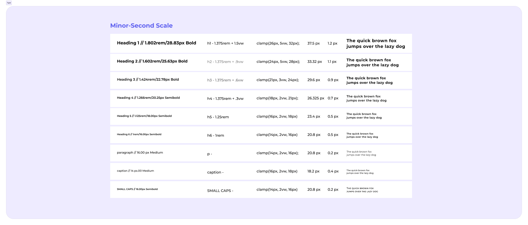
Next, I tackled typography—perfecting the weight, color, size and spacing. I used the minor second scale and found it looked best when testing on our UI.
Jason and I dug into the clamp() CSS function, which was a fun learning experience for me and allows for type to have a minimum and maximum size based on screen responsiveness.
Buttons
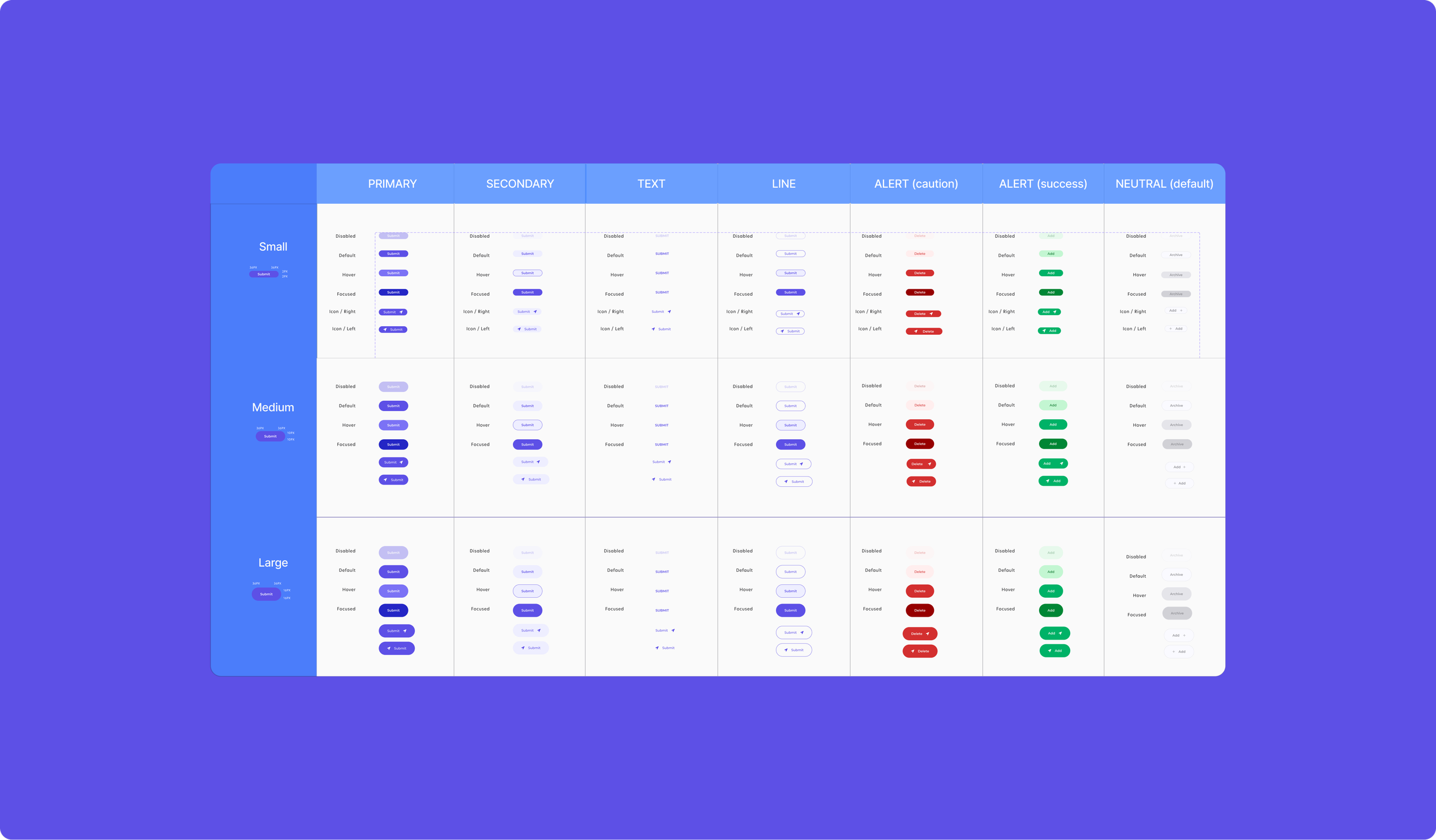
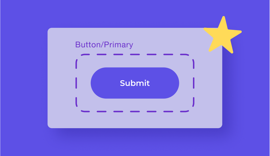
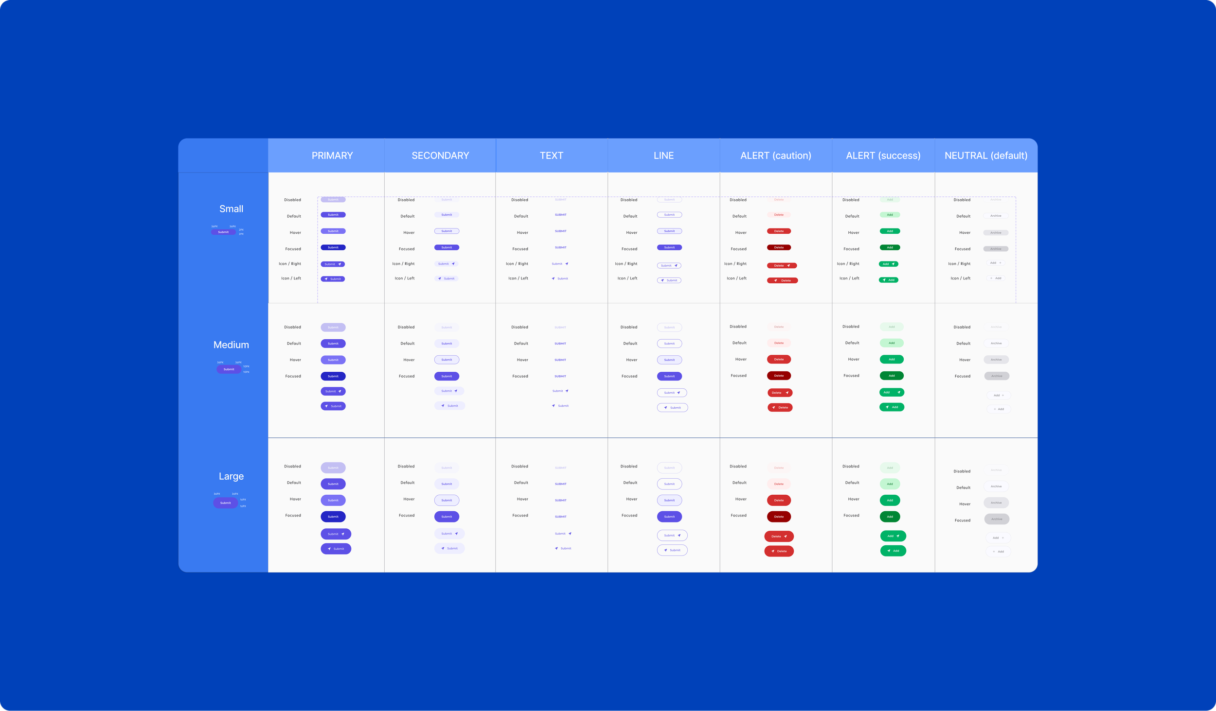
Buttons were a fun challenge because I got to think about hover states and all of the use cases. Our primary color is used to create our primary, secondary and line buttons, neutral colors were used as our go-to table buttons and warning and danger colors were used for success and alerts. This was one place that having a large collection of colors and testing accessibility really paid off.
I created round buttons because it supported our branding of warmth, innovation and friendliness. If I got the chance to do it again, I would use rounded corners that didn’t make the button circular, because it fits better in table headings and forms.
Results
It's taken trial and error, but we knew that it was going to be time well spent. Developers can now work fast and with ease, our end-users get a consistent, enjoyable experience and I, as the designer, get to focus more on the user's job-to-be-done and less about if the UI is aesthetically enjoyable, even if we are rapidly pushing new updates.
Looking Forward
It was exciting to dive into something I had never done before, learn a lot, and improve the work of my team at the same time. This experience has continued to inspire me to find new solutions and continue my personal growth.
As our goals shift and new feedback is received, I have worked to improve and expand upon this Design System. With the solid foundation we created, I hope it can one day be used by a team of 400 or 4,000. Until then, we will crush it as a team of 4.