Jellies
Building a Jellybean Brand from Scratch.
How Can a New Brand Compete in the Market?
An individual class project
Challenge:
Create a brand and package design that entices consumers to branch out from existing candy products.
Research:
Because there was no relevant data for this project, I took the research into my own hands. In order to decide what kind of packaging to use for my jellybeans. I ran out to the convenient store by my house and bought 7 different candy packages, from large to small, bag to box. I emptied out each package, then filled it with jellybeans. I had 10 people individually eat jellybeans out of every package, noting what they did and did not like from the experience, then rated it from 1-10.
Later, I surveyed multiple demographics on what would compel them to branch out and try a new brand of candy.
Insights:
8/10 people preferred a small boxed package to eat the jellybeans.
Most people were satisfied by the sensation of the jellybeans rumbling in the box.
People respect and gravitate towards candy brands that invoke a retro feeling, with bright colors. They like the excitement of a modern brand that brings nostalgia.

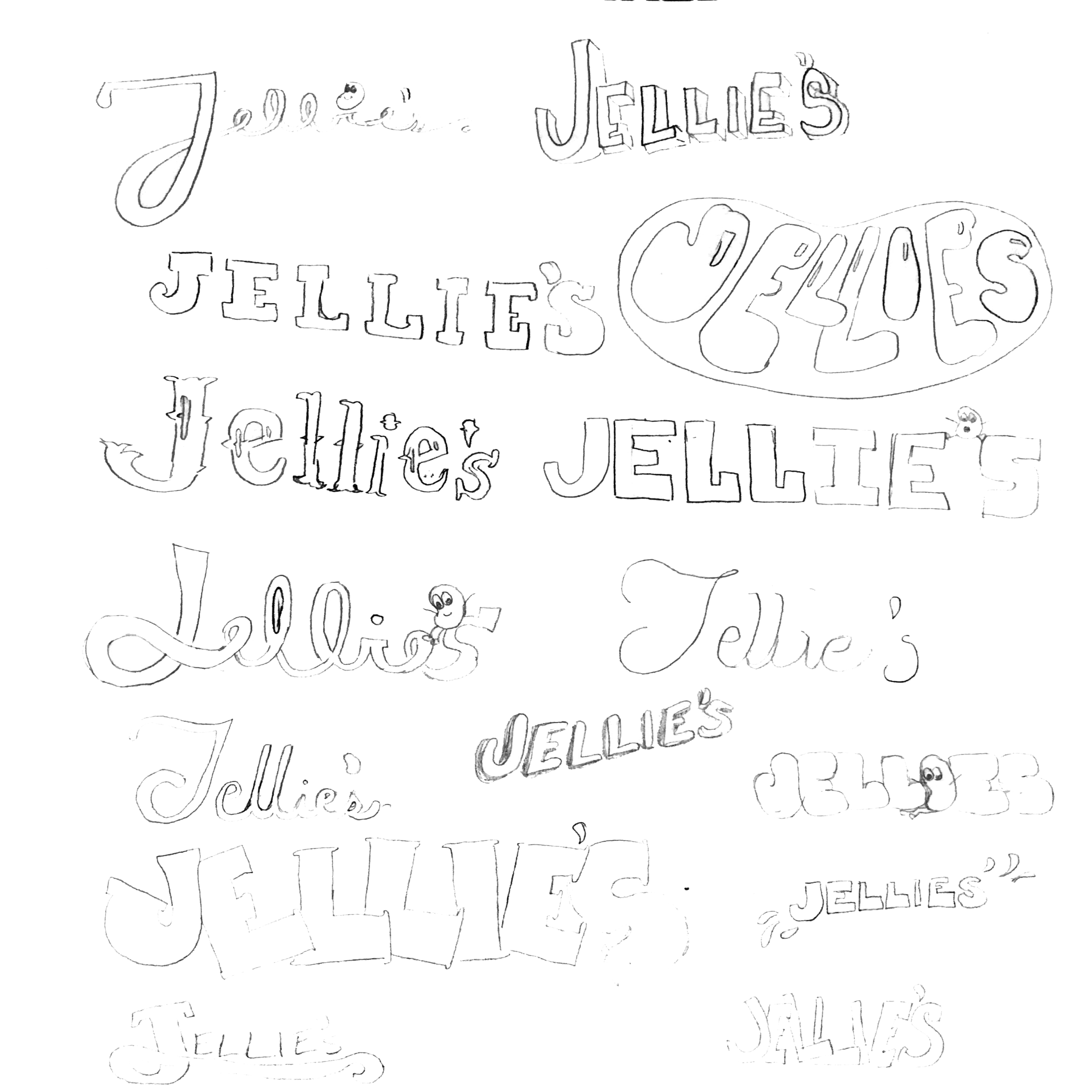
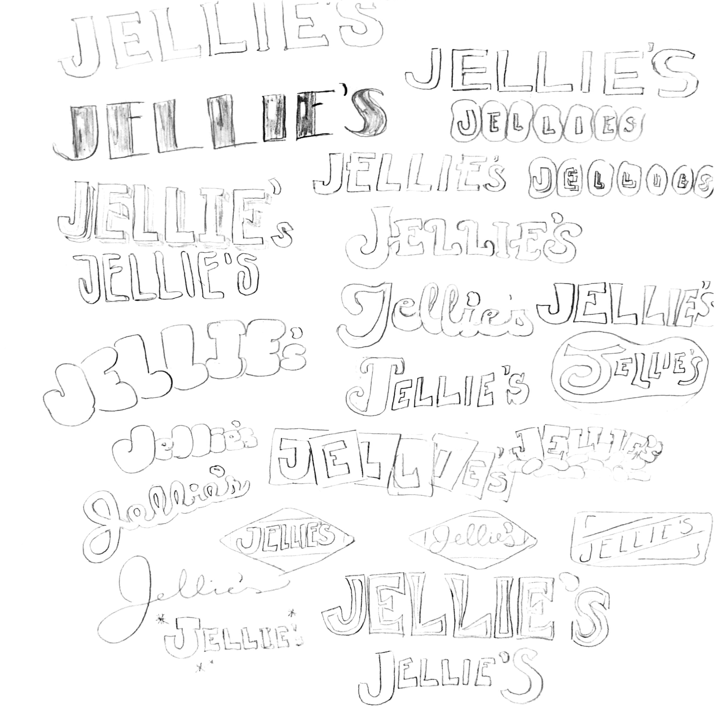
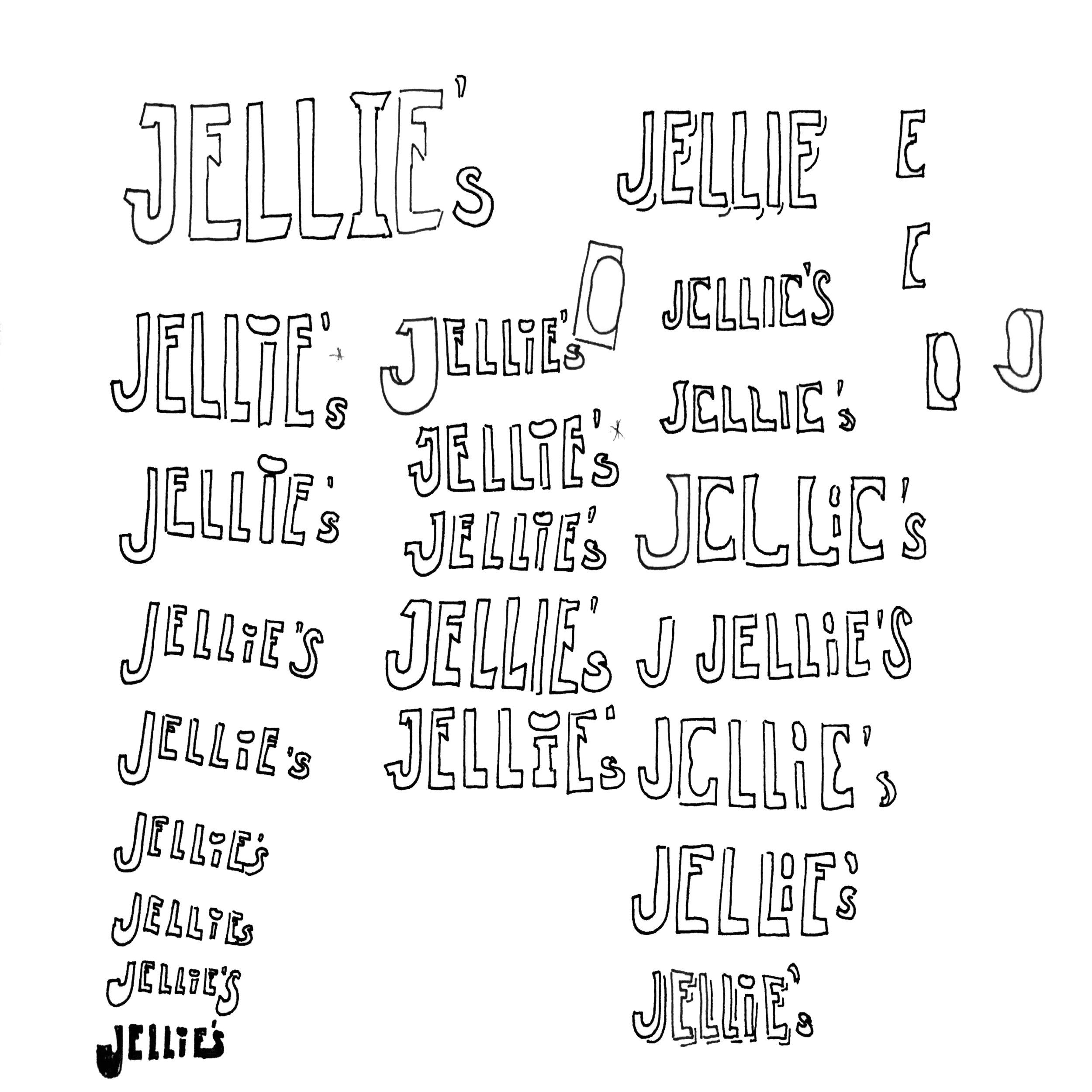
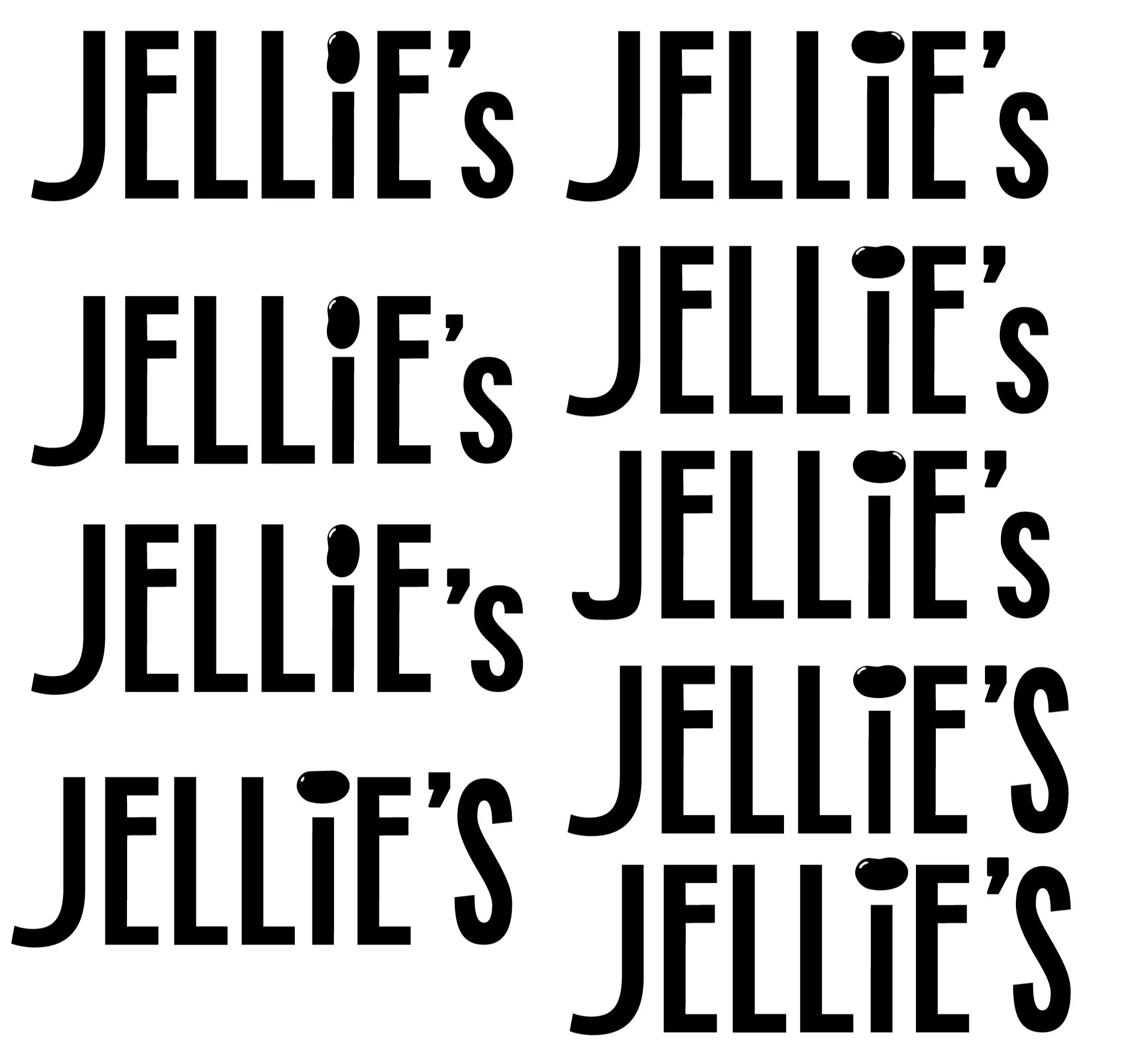

Creating a Retro Logo:
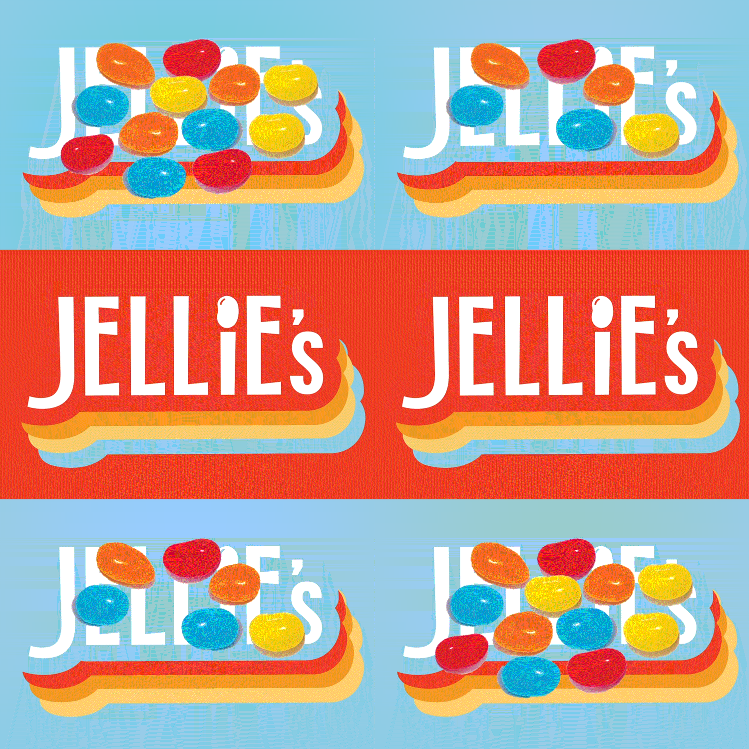
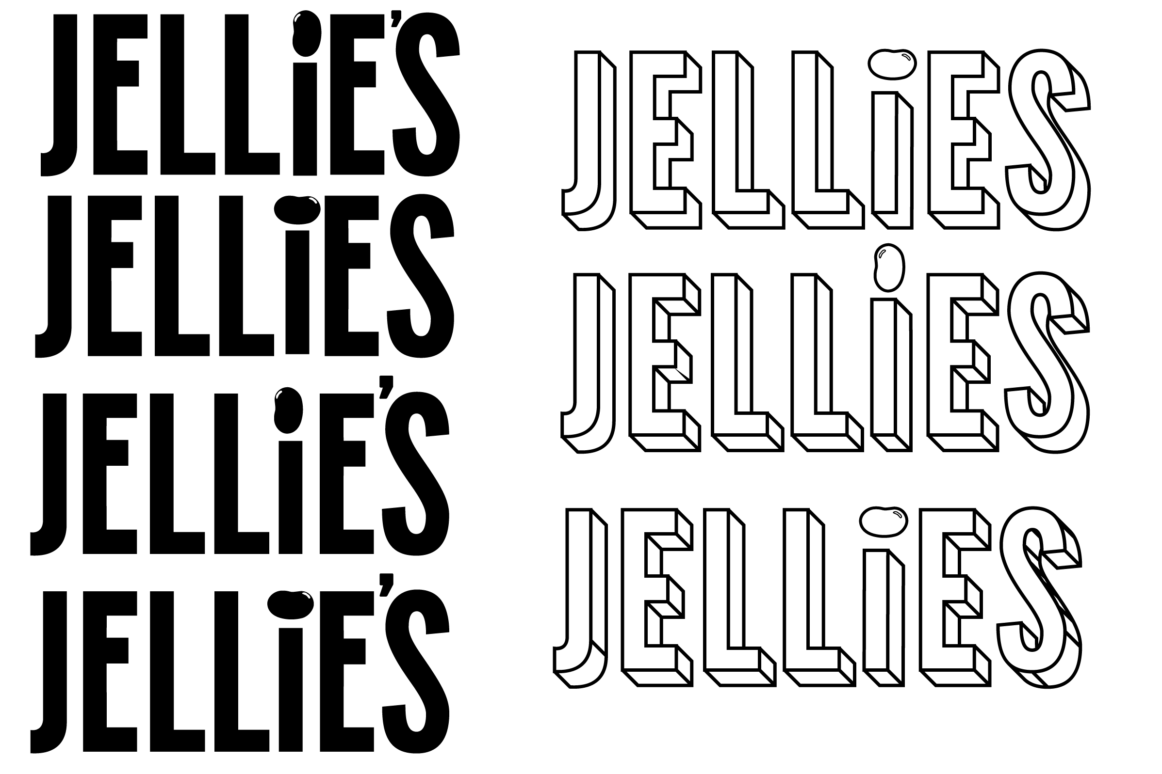
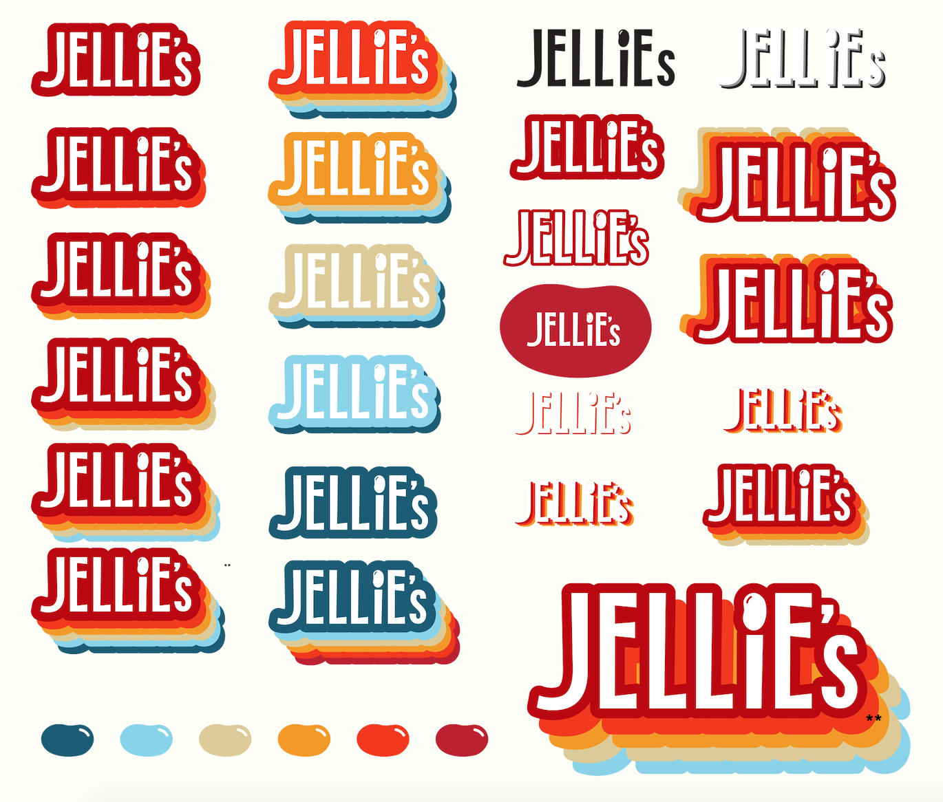
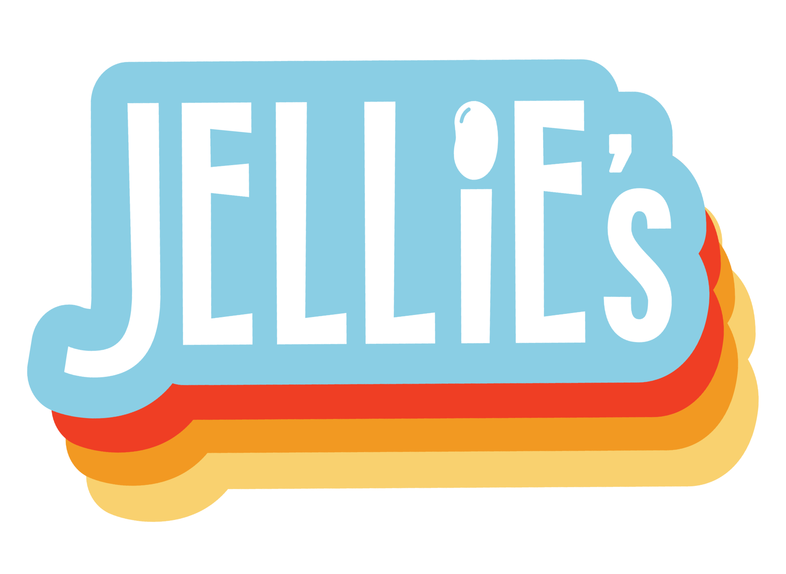
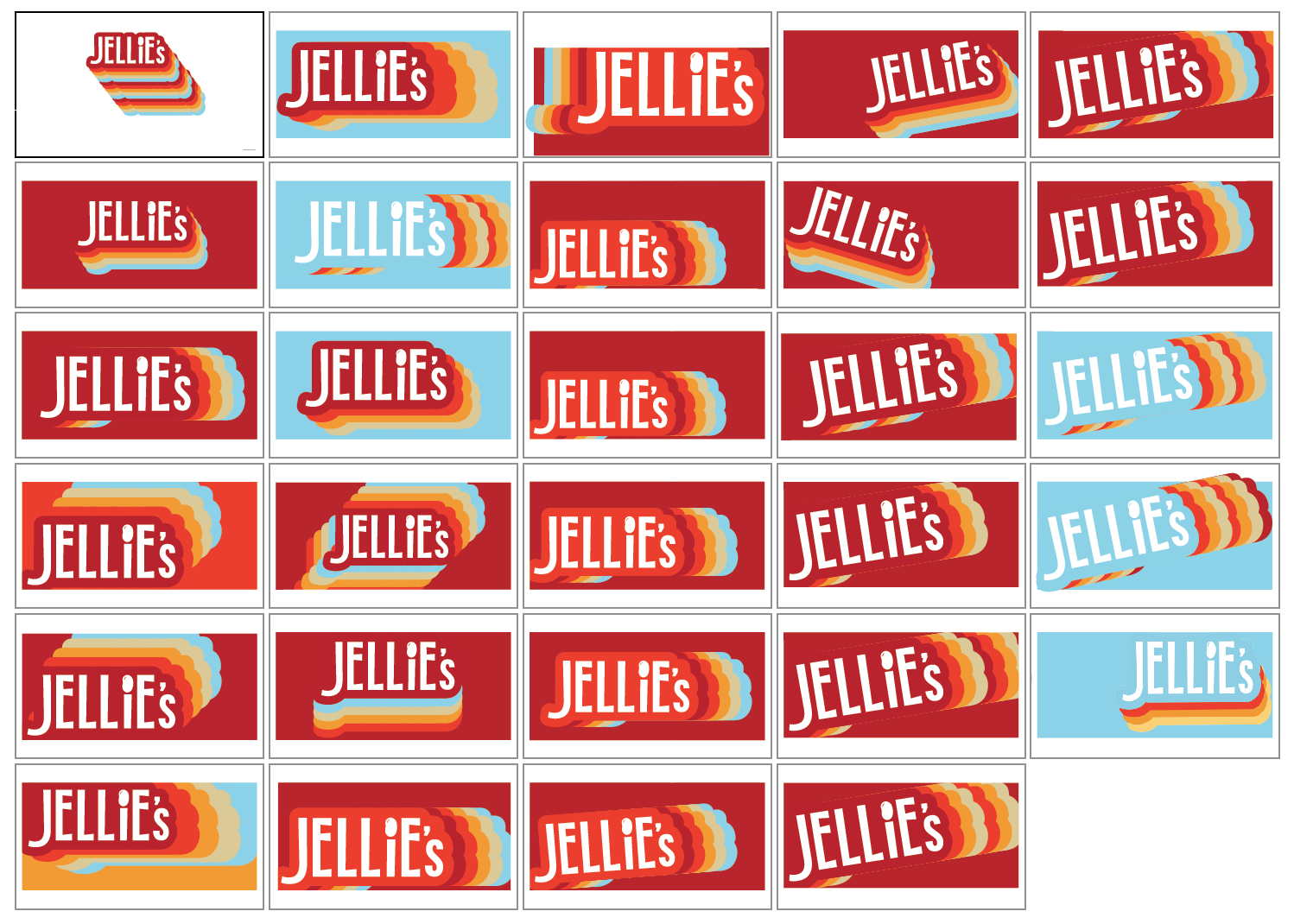
After many iterations and sketches, I eventually settled on the blue logo below. The custom font has a modern-quality with the sans-serif, but I embellished the ends to curve slightly, adding a 20's-like quality.
To really gain the retro-look, I created a repeating shadow effect with the brand colors. This also helps promote the brand identity.
My main concern was that the logo was not simple enough or easily reproduced, so I dropped the "J" down a bit and smoothed the edges of the shadow effect.
Lastly, I added the small touch of a jellybean on the "i". This decision allows the brand's purpose to be more apparent when taken out of context. It also allowed the opportunity to use the jellybean as a symbol of the brand used in other advertisements.
A Package That Attracts:
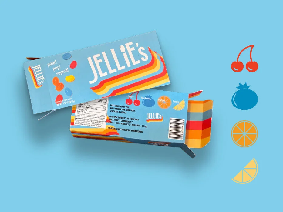
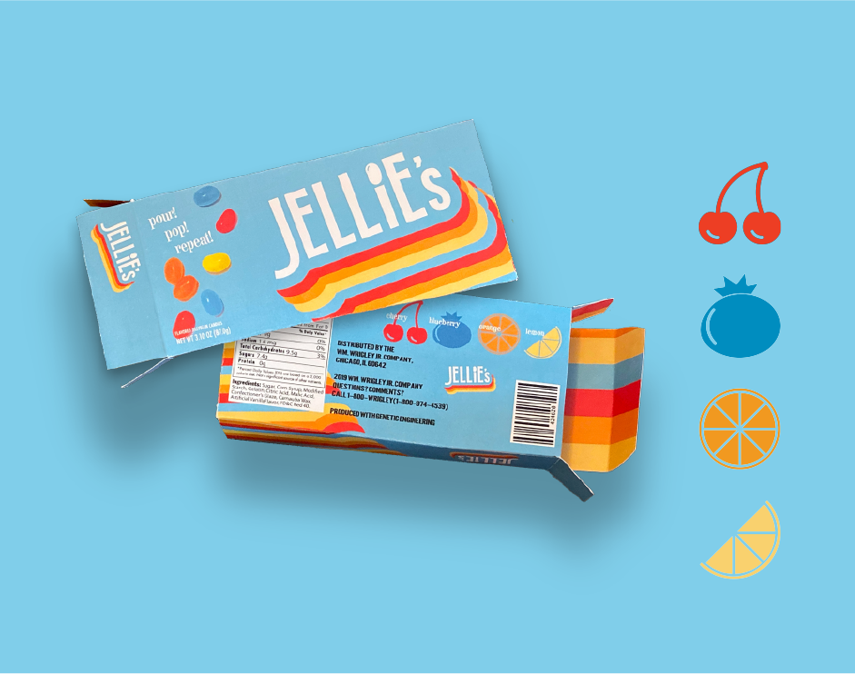
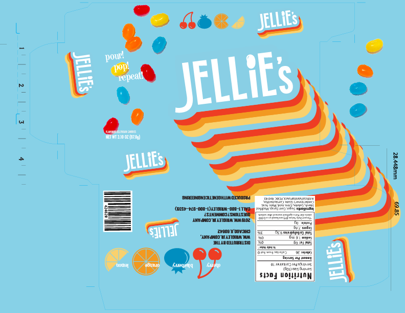
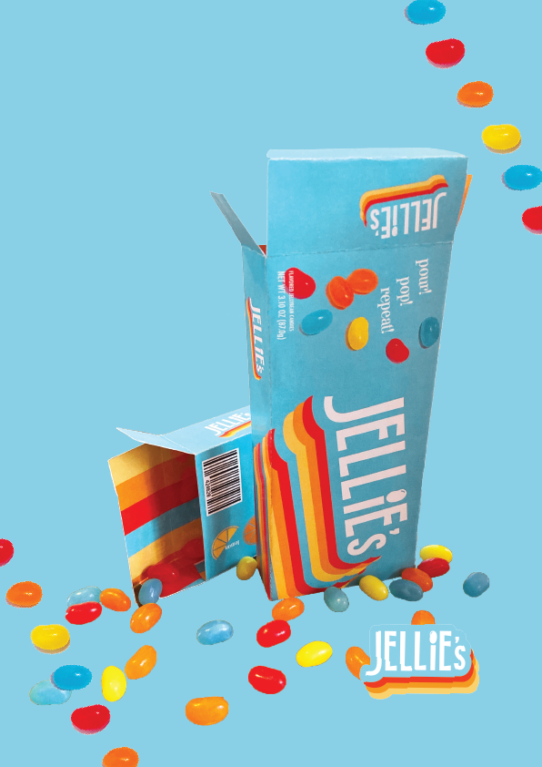
Due to my insights, I decided I wanted to make sure that my packaging had:
1. Retro elements
2. A representation of the product
3. A bright, attractive color

Advertising:
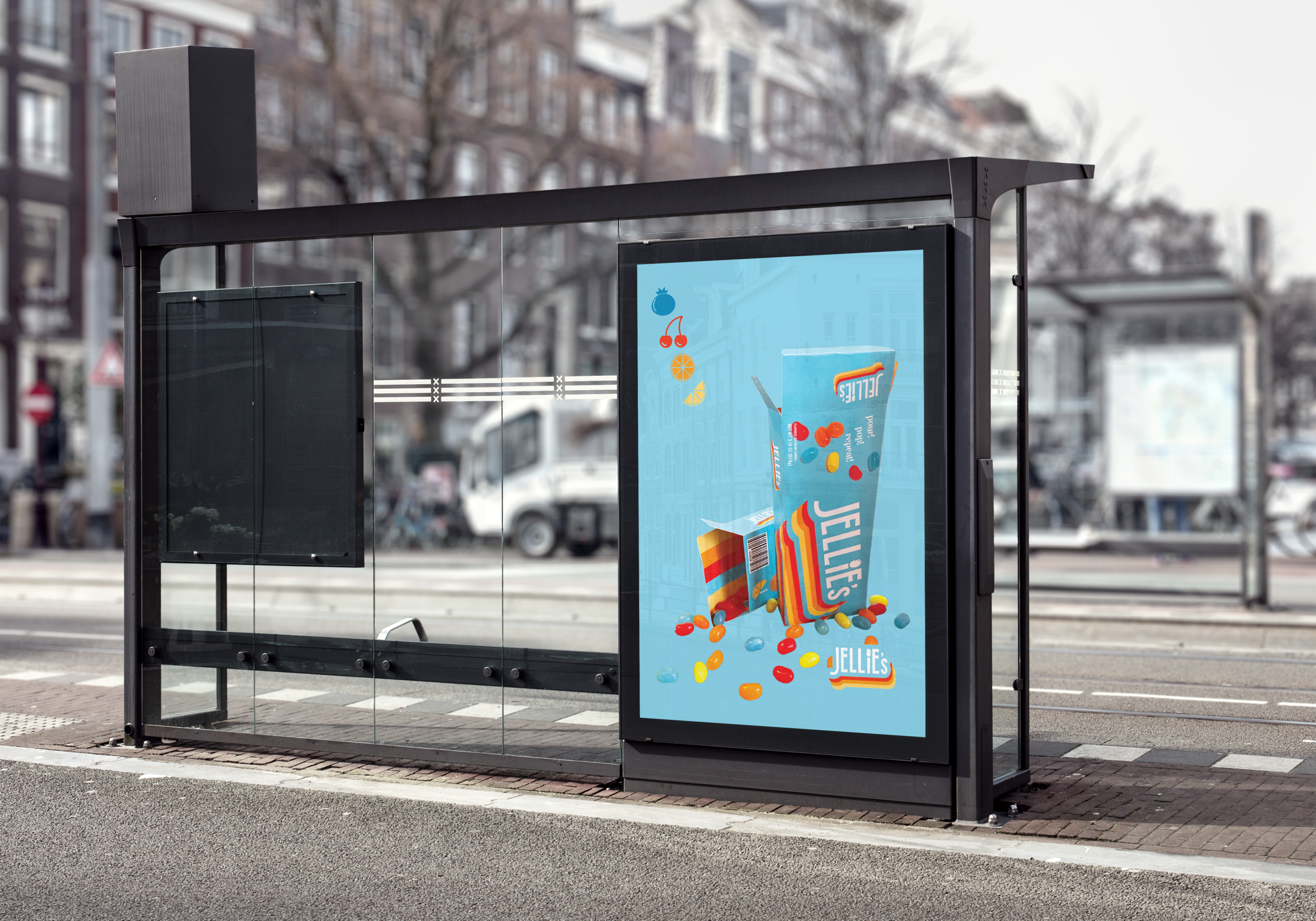
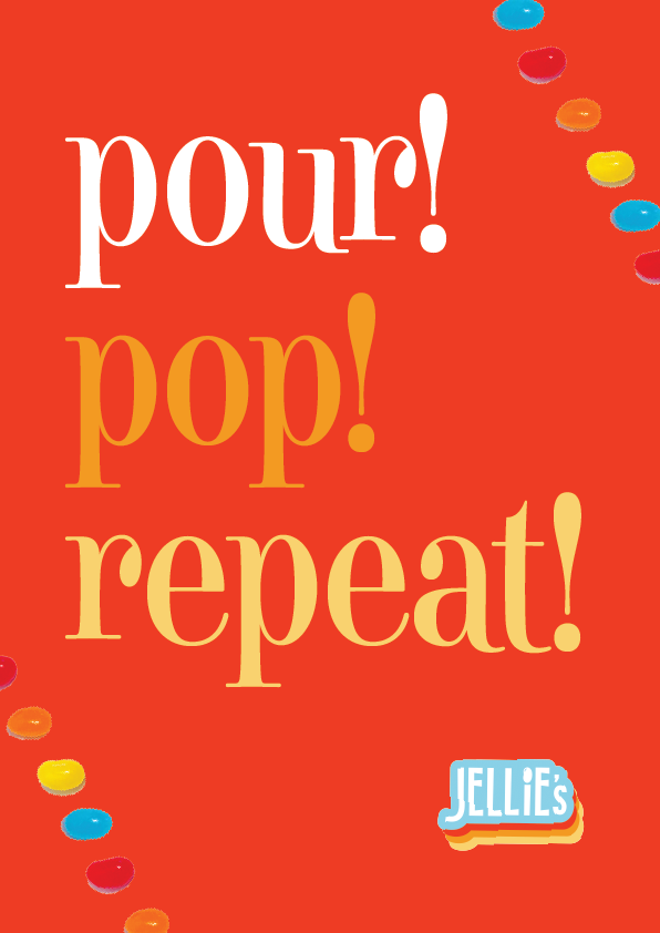
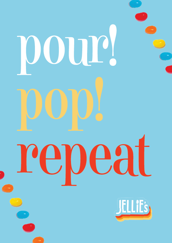
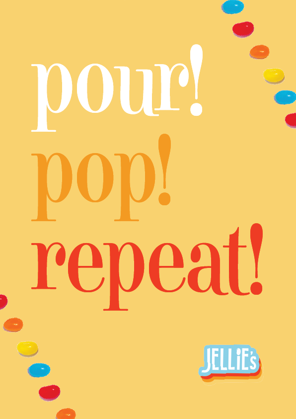
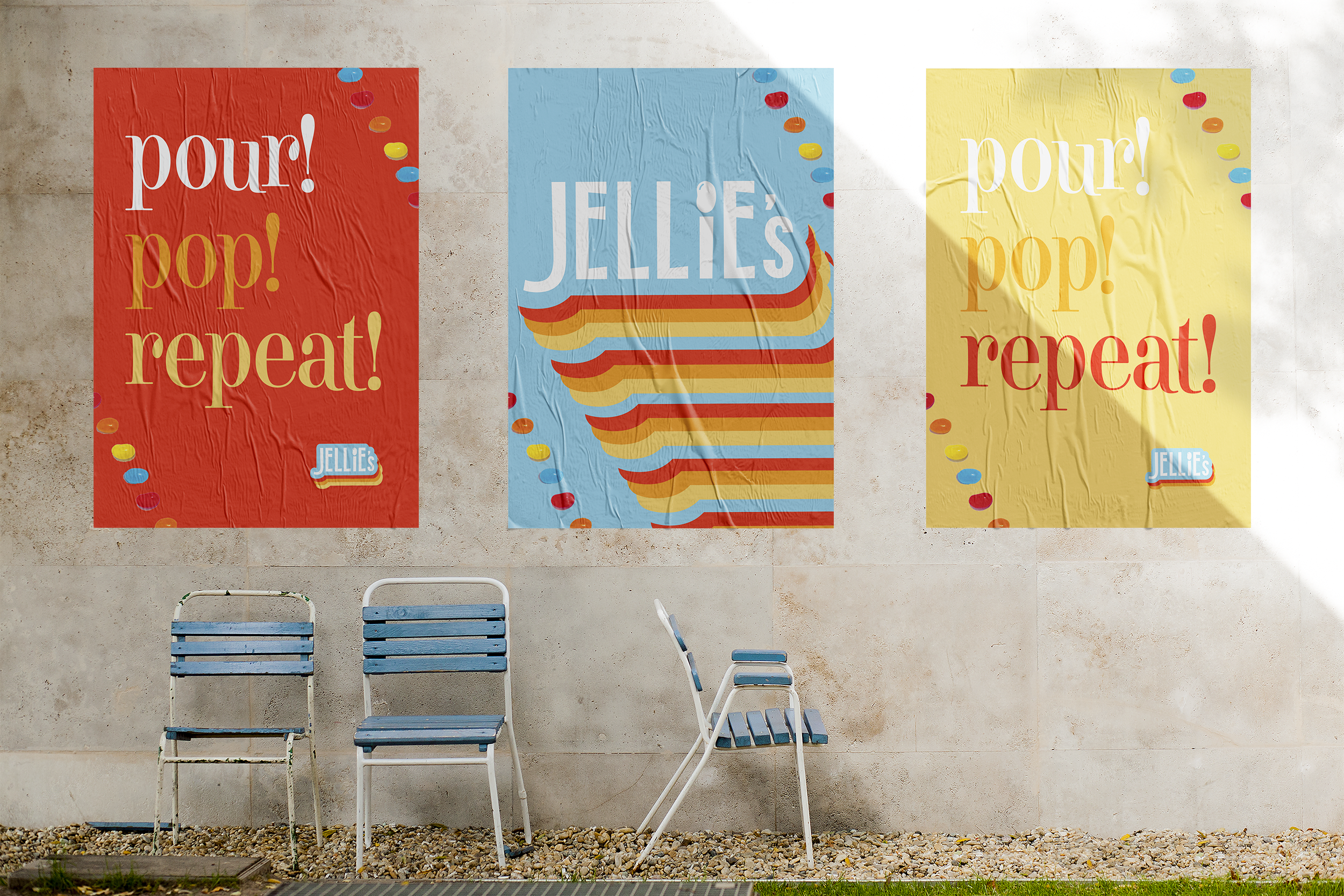
In order to exhibit a retro feeling, I decided I wanted to add an exclamation point to my slogan. This was a very popular advertising technique used in the 50’s and 60’s. I also wanted to incorporate how the jellybeans are eaten. Eventually, I came up with “pour! pop! repeat!”. It’s fun to say, it’s catchy and it gives room for potential advertising campaigns.