

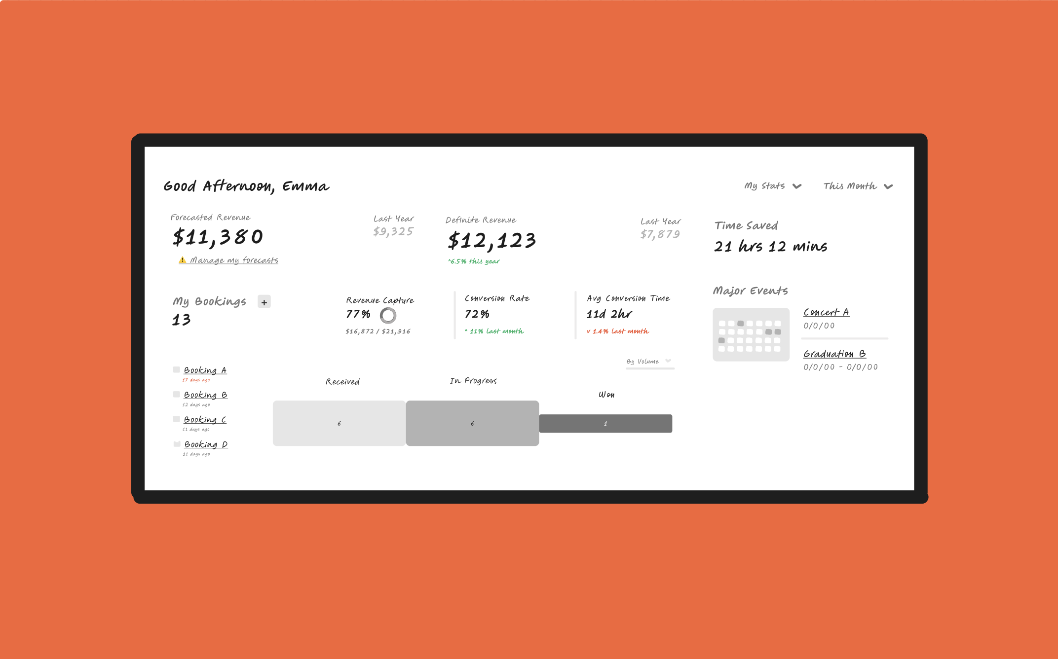
Sales Dashboard Analytics
// UX + UI
🚧 This study still in progress. More coming soon.
Working with a freelance client in the hospitality space, I created a low-fidelity dashboard experience to help transfer designs into Tableau.
Goal
Creating a more streamlined experience for sales users looking to reach their monthly goals and complete upcoming tasks in the hospitality industry.
Roles
Emerson Hobson — UX/UI Design
Client Head of Marketing — Data
Client Product Manager — Research
Stakeholders
Internal:
• Developers
• Current users
• Investors
External:
• Sales Managers
• Sales Representatives
• Executives
• Data Analysts
Problem
Sales users are struggling to find the data they are looking for on the dashboard and end up clicking around to man.
The product is not sticky. (Users aren’t finding purpose in logging in to see their data)
Market + User Research
What’s out there? Who is it for? How can we stand out?
In order to understand how sales users are currently using the dashboard, the product manager on the team provided me with an in-depth competitive analysis, quotes from talking to current users, and research results from how users are currently clicking around in the product (I do not have access to share the heatmap from Hotjar).
My role:
• Analyze the competitive research and interviews
• Use the data and research to understand what sales data the users are seeking in their analysis
Competitive Analysis:
Examples of research I used to begin my design process:
(From product manager)
Research Insights:
Sales users are looking for quick, actionable numbers to prove their ROI
In order to make the product sticky, daily tasks and to-dos are essential
Sales users want to see how close/far they are from their monthly goals
Users want to know if tasks are overdue or if events are coming into town soon
With my insights gathered, and with the collaboration of the project manager, I created a requirements document to begin my low-fidelity designs from.
I find this helpful in making sure the goals are clear, especially when iterating with lots of types of data and the different way to visualize the tasks.
Planning:
From my gathered insights, I created small post it notes in Figjam and organized different elements based on the hierarchy of my assumption of the sales user’s needs.
Once I liked the story the placement of sticky notes told, I began iterating on different ways to show the data provided, as well as the size and position of each element.
Challenge:
My client wanted to keep the scope small, so my job was to take the data we were currently using and find creative ways to implement it in a powerful way.
The current scope is to use Tableau to build out the elements, so the hand-over process is in low-fidelity.
Once built in Tableau, I plan to help recolor the UI so that it looks clean and matches the current product.
Current State:
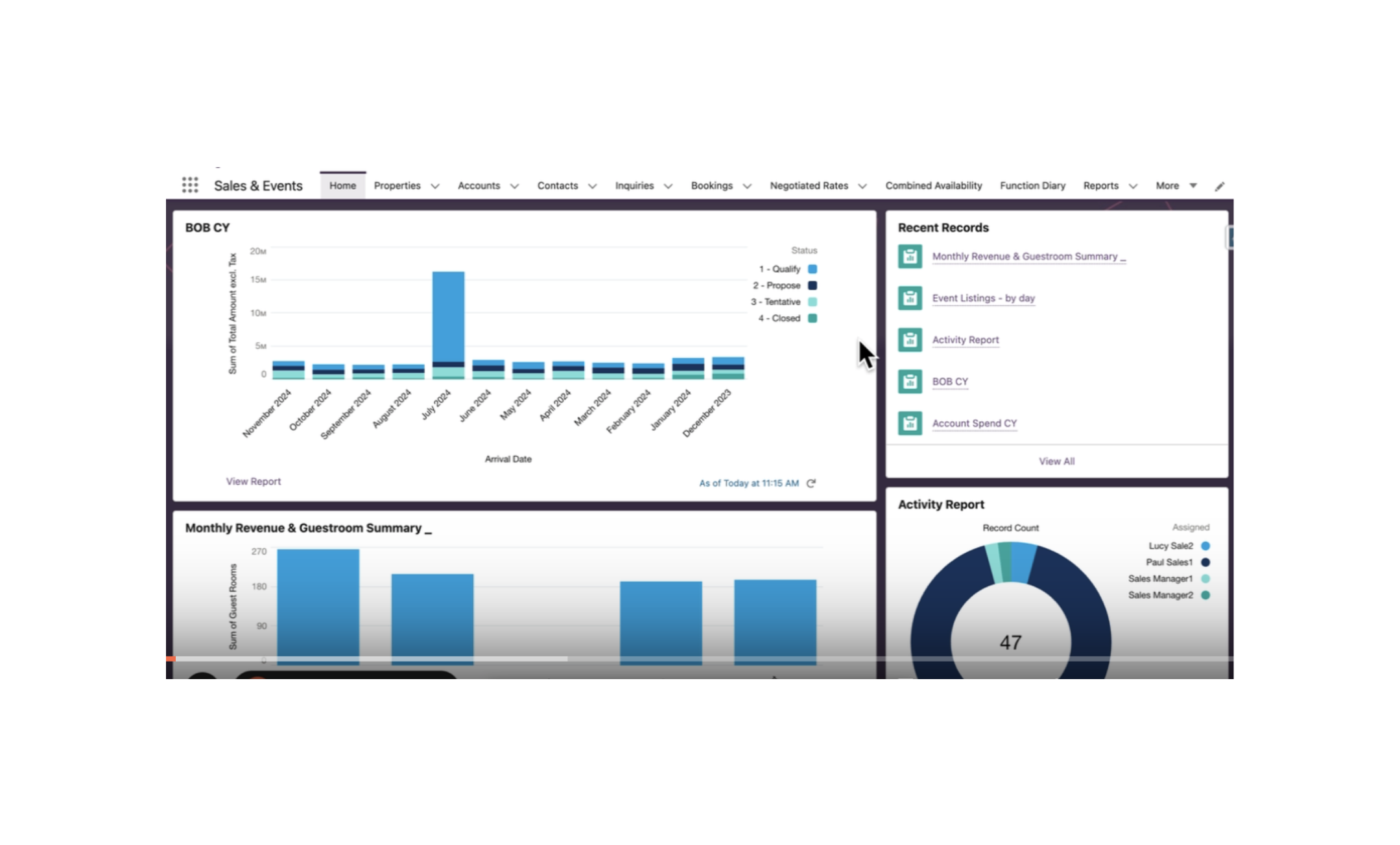
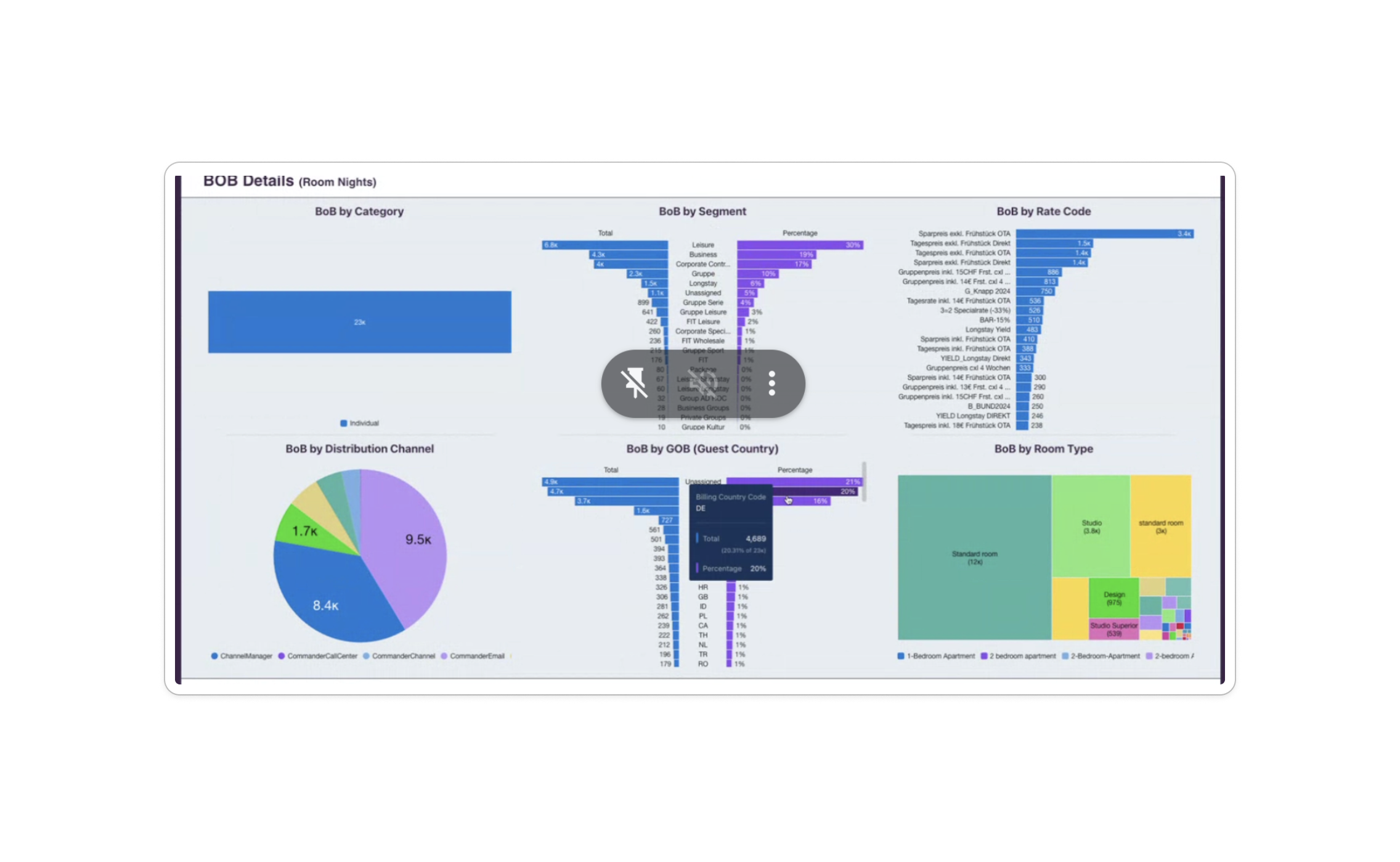
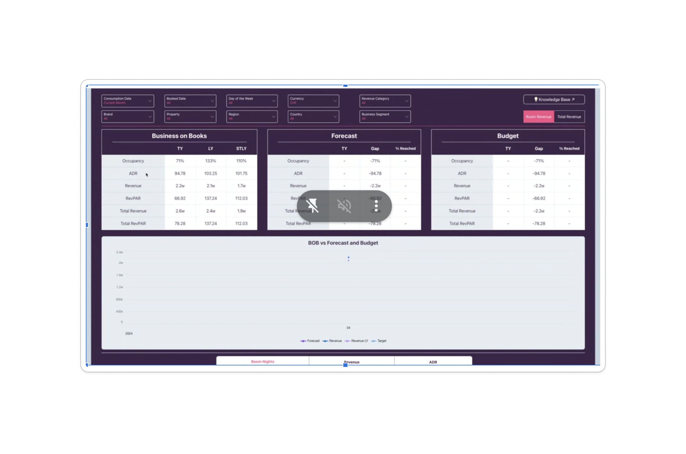
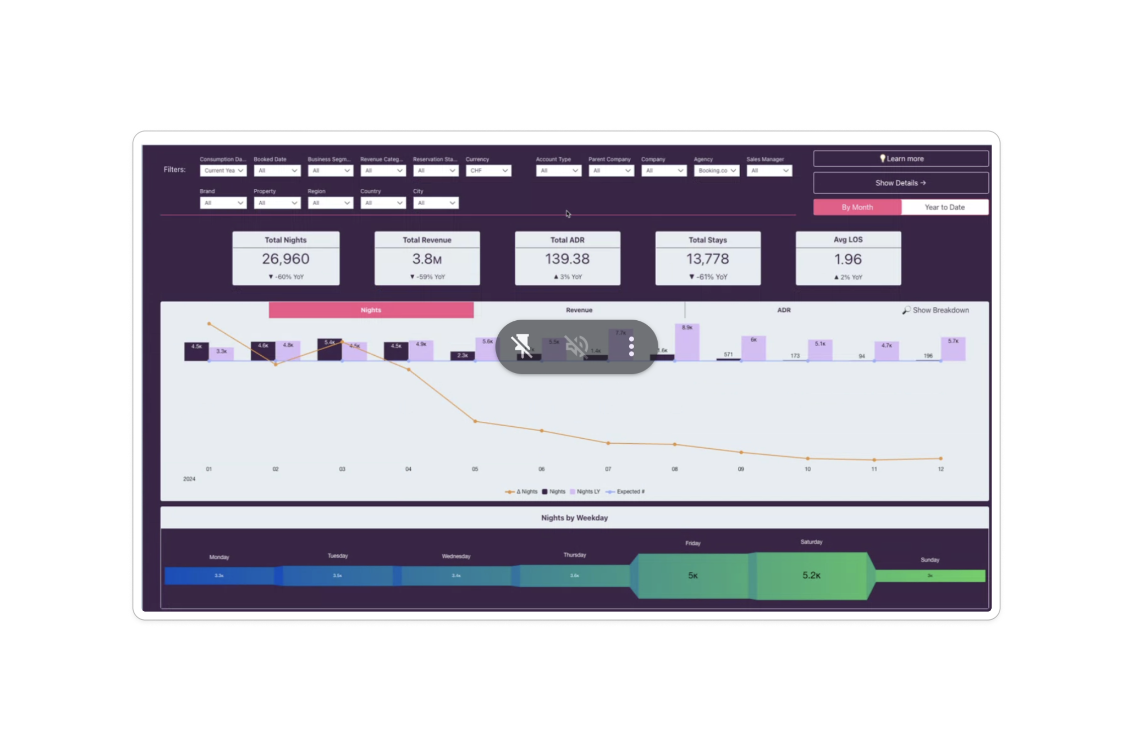
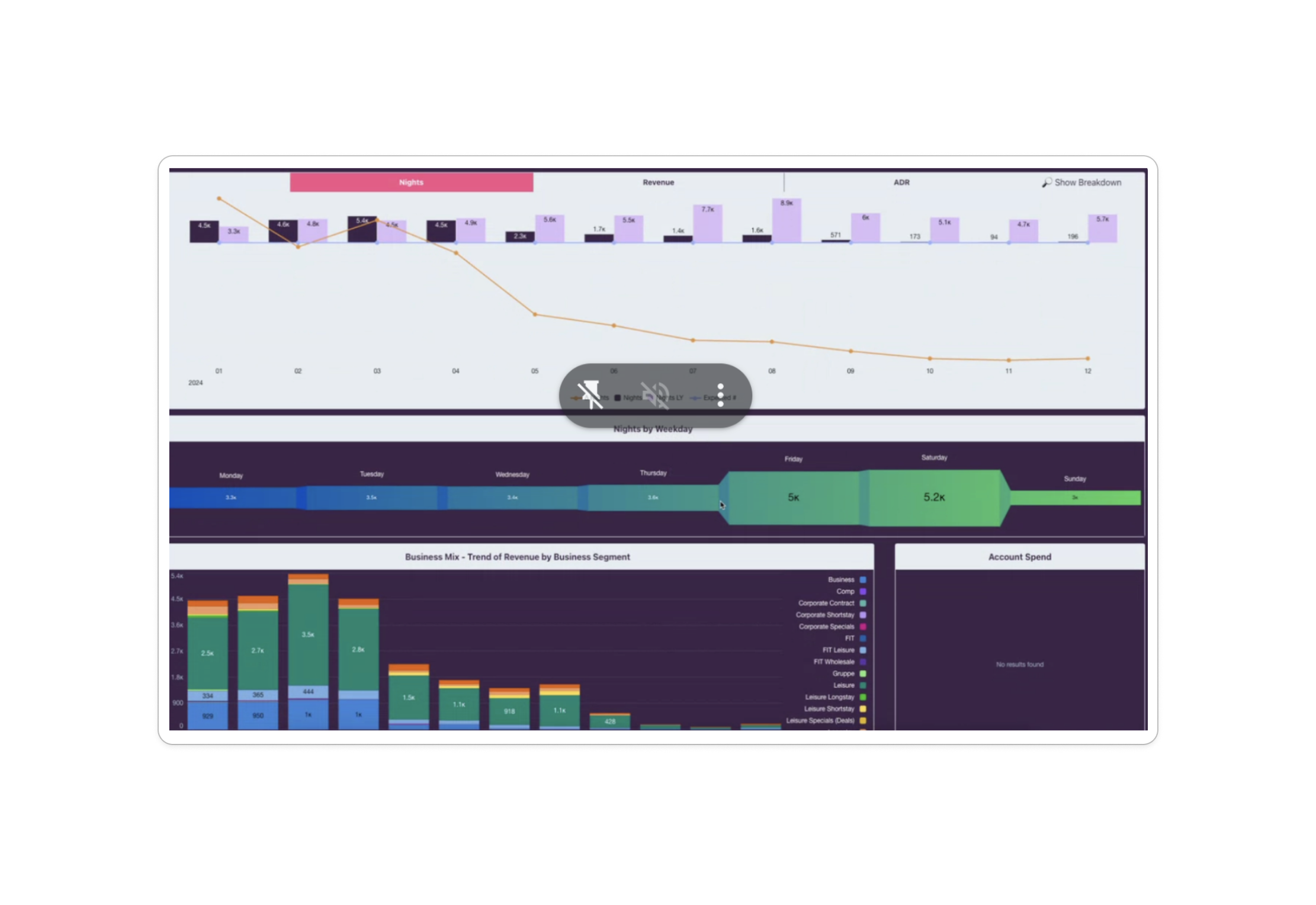
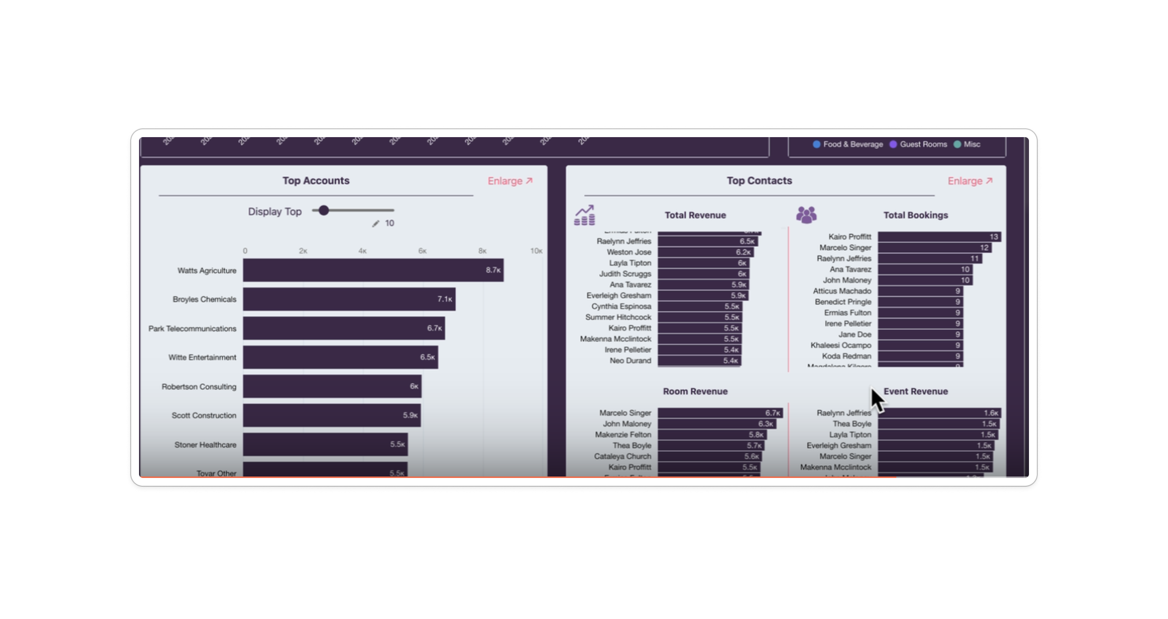
Iterations:
V1
V5
A few pieces of feedback in my implementation from V1 to V5:
“In addition to seeing upcoming events in the hospitality space, users often want to know if there are any events happening in the city that may affect their bookings (ex. Boston Marathon)”
Solution: A “Major Events” widget that highlights any upcoming events in the city.
“Investors want to incentivize the use of the product by showing how it saves time in comparison to other solutions.”
Solution: A “Saved Time” widget that uses the average time of use in the platform vs the average time it takes to do the same task in competitive solutions.
“Average conversion time and conversion rate can be attributed to each booking stage and should be comparable.”
Solution: I consolidated each booking stage into a parallelled layout so that the time and success for each is comparable at a glance.
“Not all user types will need to see each booking stage.”
Solution: Showed a variant of user’s types dashboard from all types, only negotiated rates and no negotiated rates. I made sure to adjust the positioning of the elements so that one user type does not have a large hole in the middle of their dashboard.
Next Steps:
🚧 This case study is still in progress. Working on updates.
Now that the low-fidelity designs have been handed-off, the next step is to get feedback from users. The designs are currently in user-interview testing and once iterated from there, will be created in Tableau.
Instead of creating a high-fidelity design, once the dashboard is created in Tablaeu, I will work with the team to clean up the UI and make any necessary changes to help create a complete design.
This way of working helps save development a lot of time until they want to commit to a larger scope and build any of the pieces out custom.